


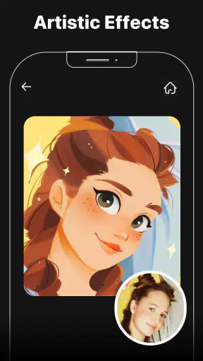
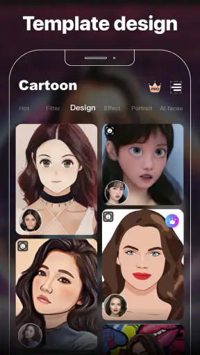
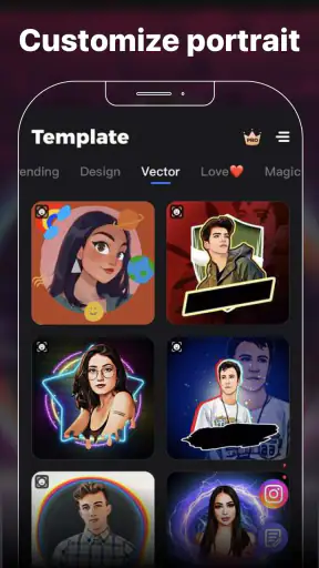
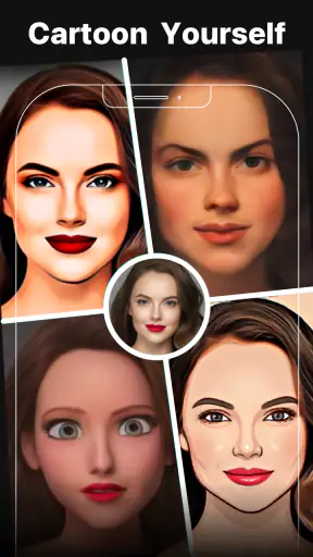
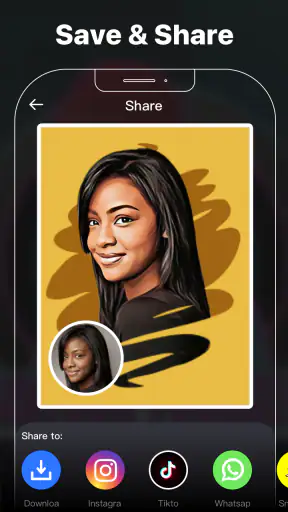
Cartoon Photo Editor: Facee is the kind of creative app I open when an ordinary portrait needs a quick visual change rather than a full editing session. It sits in the video players and editors category, although my main use for it is working with still photos. The appeal is straightforward: choose an image, try a cartoon or anime-style treatment, adjust the result enough to make it feel intentional, and save something suitable for sharing.
After spending time with it, I see the app as a fast-effect tool rather than a complete photo studio. It is useful for profile pictures, casual posts, invitations, playful messages, and simple before-and-after experiments. It is less convincing when I want precise retouching, carefully controlled color grading, or a polished illustration that looks as if it was drawn by hand.
The app is free to install, with optional purchases ranging from $0.99 to $31.99 per item. That makes it easy to test without committing money immediately, but it also means I pay attention to which effects are available during normal use and which parts of the experience may encourage an upgrade. The content rating is Everyone, so its basic concept is approachable for a wide audience.
How I use Cartoon Photo Editor: Facee from the first photo to the final image
A simple baseline workflow works best
My most reliable routine begins with a photo that already has reasonably clear lighting. I do not expect a filter to rescue a very dark, blurry, or heavily compressed image. A face that is visible and separated from the background gives the cartoon treatment more useful information to work with, especially around the eyes, hair, and outline of the head.
I then choose an effect based on the mood I want instead of tapping through everything randomly. A softer cartoon look suits a friendly profile image, while a stronger anime-style treatment can work better for a playful post. The important habit is to compare a few related options before making other changes. Otherwise, it is easy to spend time adjusting a style that was never right for the original photograph.
One practical tip is to keep the original image untouched and treat every edited result as a separate version. That gives me a safe reference when a filter makes skin tones too flat, removes useful facial detail, or changes the expression more than expected. It also helps when I want to create two different moods from the same portrait without repeatedly starting over.
Once I have a promising effect, I inspect the face at normal viewing size rather than judging only the enlarged preview. At close range, small artifacts can look dramatic; at phone-screen size, the same result may feel perfectly acceptable. I check both views because the final purpose matters. A profile image needs a readable face at a small size, while a printed image or a larger social post exposes weaknesses more clearly.
Choosing photos that give the filters a fair chance
In my experience, front-facing portraits are the easiest starting point. Three-quarter angles can still be interesting, but stronger stylization may simplify one side of the face or make hair merge with the background. Group photos are more unpredictable because the result has to interpret several faces at once. For a dependable first attempt, I use one person, a clear expression, and a background without too many competing shapes.
Lighting is another overlooked factor. Even illumination usually produces a more balanced cartoon effect than a portrait with a bright window on one side and deep shadow on the other. I also avoid photos with sunglasses, hands covering the face, or very small subjects. Those images can be worth trying for experimentation, but I would not choose them when I need a clean avatar quickly.
A useful everyday scenario is preparing a new messaging profile picture. I can take a recent portrait, test a gentler cartoon treatment, and compare it with a more exaggerated version. The softer result is usually easier for friends to recognize, while the bolder one has more personality. I would save both only if they serve different purposes; exporting every variation quickly creates a cluttered gallery.
What the developer’s focus means in practice
Palette Cartoon Photo Editor APP has built this product around quick visual transformations, and that focus is apparent in the way I approach it. I do not use it as a replacement for a timeline editor, a professional retouching suite, or a drawing application. Its strength is the short path between selecting a photo and seeing a noticeably different version.
That narrow focus is helpful for casual users because there is less need to understand technical editing language. It is also the reason experienced users should set expectations early. If I want to control individual facial features, reshape a background, or make a sequence of detailed corrections, I would rather move the image into a more specialized editor after using Facee for the initial style idea.
Settings worth checking before saving
I recommend checking the available adjustment controls after selecting the main effect, not before. The most attractive preset can become less useful if it is too intense for the photograph. When controls are available, I prefer small changes: reducing an exaggerated look often preserves the person’s identity better than adding several effects on top of one another.
This is where a repeatable habit makes the app more useful. I compare the edited image with the original after every meaningful change. If the face becomes smoother but the eyes lose definition, I step back. If the background becomes visually noisy, I choose a simpler treatment rather than trying to compensate with more decoration. The goal is not maximum transformation; it is a result that still communicates who is in the picture.
I also check the crop before finalizing. A cartoon effect can make a portrait feel more tightly framed than the original because strong outlines draw attention toward the face. For a square avatar, I leave enough space around the head so the image does not feel cramped. For a story or post, I consider whether the subject remains clear when the image is viewed vertically on a phone.
Another useful check is the preview at the size where it will actually be used. A result that looks balanced in the editor may become too pale after being reduced, while fine line details may disappear completely. I do not assume that a dramatic preview automatically makes a better final image. I choose the version that remains legible after sharing.
Faster patterns for repeat users
When I use the app repeatedly, I avoid treating each image as a completely new project. I start with a small set of photo types that I know work well: clear headshots, pets with visible faces, and simple outdoor portraits. This reduces trial and error and makes the effects easier to compare. It also reveals which styles suit my own lighting and camera habits.
For a batch of related images, I use the same decision order: choose the photo, test a restrained style, inspect the face, check the crop, and then save only the strongest version. I do not try to force every photo into the same filter. Similar settings can produce very different results when one image has a busy background or a different angle.
A less obvious advantage of this approach is consistency. If I am making several images for a small event or a group chat, using a similar visual intensity makes them feel connected without making them identical. I might use a softer effect for a close portrait and a stronger one for a distant photo, while keeping the overall mood similar. That is more effective than applying the most dramatic option to everything.
I also suggest naming or organizing exported images immediately if the phone’s gallery makes that possible. Cartoon versions can look surprisingly similar once several have been created. Separating originals from edited copies prevents the common mistake of sharing an unfinished preview or deleting the source by accident. This is not a flashy feature, but it is the kind of habit that saves time after repeated use.
Where the app compares well with usual alternatives
Compared with a standard photo editor, Facee is more direct when the main goal is a cartoon identity. A conventional editor may offer more control over exposure, sharpness, curves, and selective corrections, but it usually requires more decisions before the image feels transformed. Here, the visual idea arrives earlier, which suits users who want to experiment rather than manually build an effect.
Compared with general social-media filters, the app feels more focused on turning a chosen photo into a stylized portrait instead of applying a temporary camera overlay. That makes it better for working with an existing image from the gallery. On the other hand, a social platform may be more convenient when I want to capture, edit, add text, and publish in one continuous flow.
Compared with dedicated illustration or AI art tools, this app is easier to approach for a simple cartoon result, but it should not be treated as a replacement for detailed creative control. If I need a specific scene, a consistent character across several images, or precise object changes, I would choose a tool designed for those tasks. Facee is strongest when the source photo remains the center of the result.
Advanced limits that become visible with regular use
The biggest limitation is the distance between a pleasing preview and a genuinely polished image. Stylization can hide some photographic imperfections, but it can also introduce new ones. Facial proportions may feel less natural, hair edges can become unclear, and a busy background may compete with the subject. I see these issues as reasons to choose the source photo carefully, not as problems that can always be fixed inside the app.
Another trade-off is control. Preset-based editing is fast because the app makes many decisions for me. That is convenient when I want a result in a minute, but frustrating when the effect is almost right and I need to correct only one area. I would not install this as my only editor if I regularly make professional portraits, product images, or detailed visual content.
The free model is also worth considering before building a large workflow around it. The app costs nothing to start, while optional purchases are available inside it. I would first test the styles I can access without paying and decide whether the available level of control matches my needs. For occasional profile images, the free experience may be enough; for frequent creative work, I would compare the purchase prompts and output options with other editors before spending.
Device compatibility is fairly broad for an older Android phone, since the app requires Android 6.0 or later. That does not guarantee identical performance on every device, so I still keep expectations realistic when working with large photos or several edits in succession. If the phone has limited storage, I would also avoid keeping every experimental export.
The current version is 2.2.0, and the app has been available since October 28, 2020. Those details matter mainly because I would not assume that a long-running app in this style offers the same tools as a recently built professional editor. I judge it by its practical purpose: quick cartoon and anime-inspired photo treatments, not an expanding replacement for every kind of image software.
Who will enjoy it, and who should skip it
I think it is a good fit for someone who wants an approachable way to make portraits more playful. It works especially well for users who do not want to learn layers, masks, or complex color controls. A teenager creating a profile image, a casual user preparing a birthday message, or a family member turning a favorite portrait into a cartoon can understand the appeal quickly.
It is also useful for brainstorming. I sometimes use a stylized version to decide whether a portrait has the right composition before spending time on a more advanced edit. If the cartoon result makes the face feel crowded or the background distracting, that is a helpful warning about the original framing.
I would skip it if my priority were natural-looking retouching, exact skin correction, typography, collage design, or professional export control. I would also choose another option for long-form video editing, despite the app’s placement among video players and editors. Its personality is clearly centered on image effects, and forcing it into a broader editing role would only create frustration.
My verdict after making it part of a practical editing routine
Cartoon Photo Editor: Facee earns its place as a quick, low-pressure creative tool. Its average rating is 4.1 from around five thousand ratings, and it has passed one million installs, which suggests that its simple concept has found a substantial audience. I would not use those figures as a substitute for personal testing, but they fit my impression: this is an accessible app with a clear purpose rather than a deep professional workstation.
My recommendation is to begin with a well-lit single-person portrait, test restrained styles first, and save only the versions that still look good at their intended sharing size. Experienced users will get more from it by building a consistent workflow around photo selection, comparison, cropping, and organized exports. Those habits compensate for the limited fine control and make the fast preset approach feel deliberate instead of random.
The best reason to try it is speed with personality. I can turn a familiar photo into something noticeably different without spending a long time learning an editing system. The main caution is equally clear: the app can suggest a style quickly, but it cannot replace judgment about lighting, composition, identity, and final use. For playful portraits and casual sharing, I would recommend giving it a try. For precise editing or serious visual production, I would keep it as a starting point and use a more capable alternative for the finishing work.


